
Biblically Inaccurate - Game UI Design
-
I was tasked with creating the user interface for the indie game Biblically Inaccurate - afast-paced, subversive, endless runner, where you play as the runner's guardian angel.
The theme was inspired by Ancient Roman architecture, which informed the design choices for the UI.
Check out the trailer here and check the UI designs below!
CREW: Designer/Developer/Story/Concept Artist/Animator/Programmer - Bellayna “Belle” Louise Lopez Writers - Ola Jones, Bellayna “Belle” Louise Lopez Artists - Serina Lopez, Bellayna “Belle” Louise Lopez User Interface Designer - Hafeez Aremu Sound Designers - Noah Luthi, Sam Hills Composers - Aizhana Nurkenova, Ben Moss Motion Graphics and Titles Designer - Eddie Tavares Marketing and PR Executive - Sofia Gerasymenko
Main Menu Background

Buttons & Sliders

Sketch from the developer
Final Design
The developer liked the idea of having the 4 main power-ups/icons (pictured below) in the game repeating themselves, so I arranged them in a diagonal pattern on a stone slab-like background I designed in Photoshop, with an orange-and-green gradient.




The developer had the idea of the buttons resembling Roman columns, completed by vines wrapping around them. I further developed the idea by adding a distressed look to the rock material coating the button itself, and added a few cracks to add some character to each button. As for the slider, I went for a jewel-type design to resemble the aesthetic of the game.
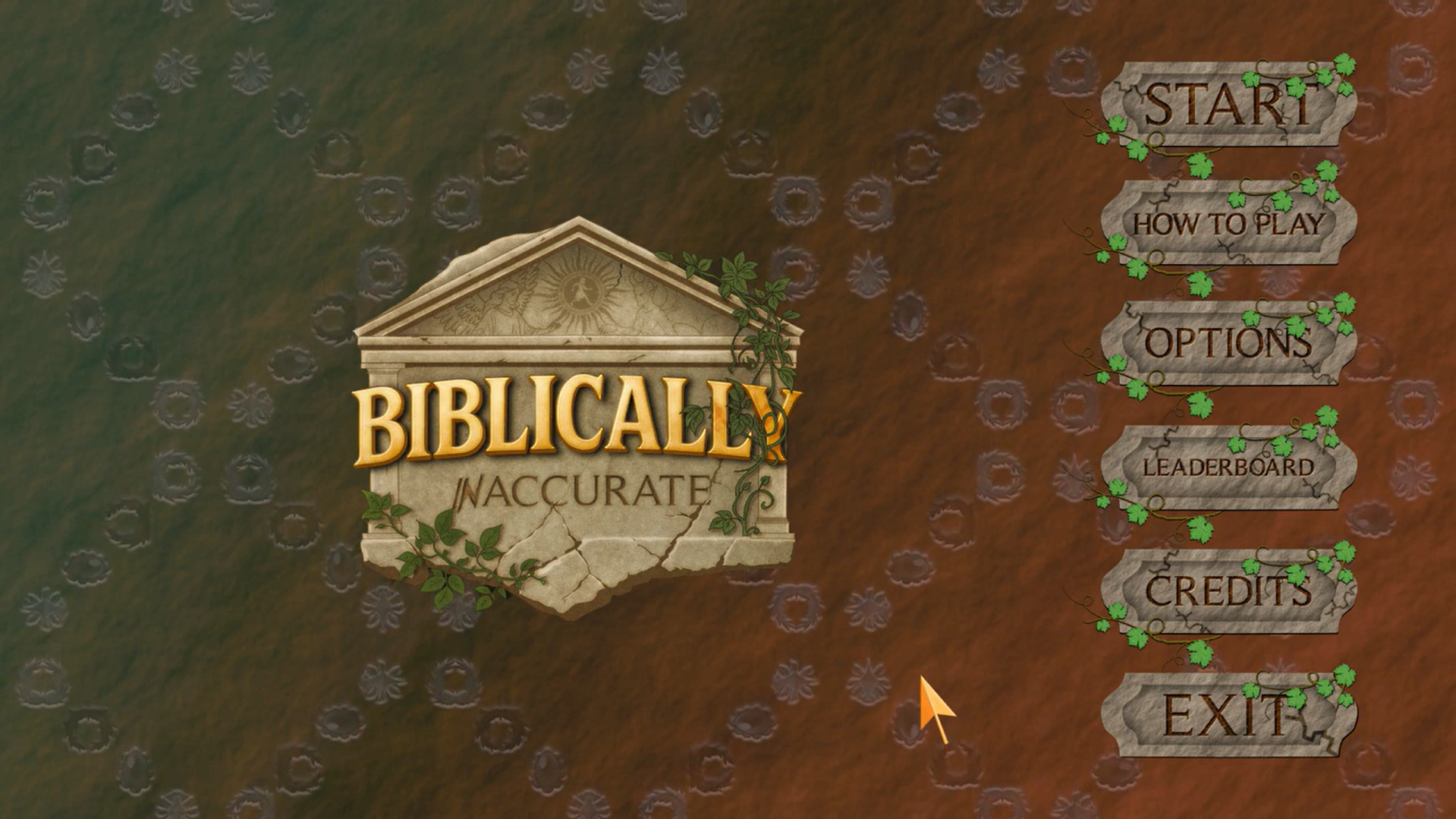
Range of buttons featured in the main menu
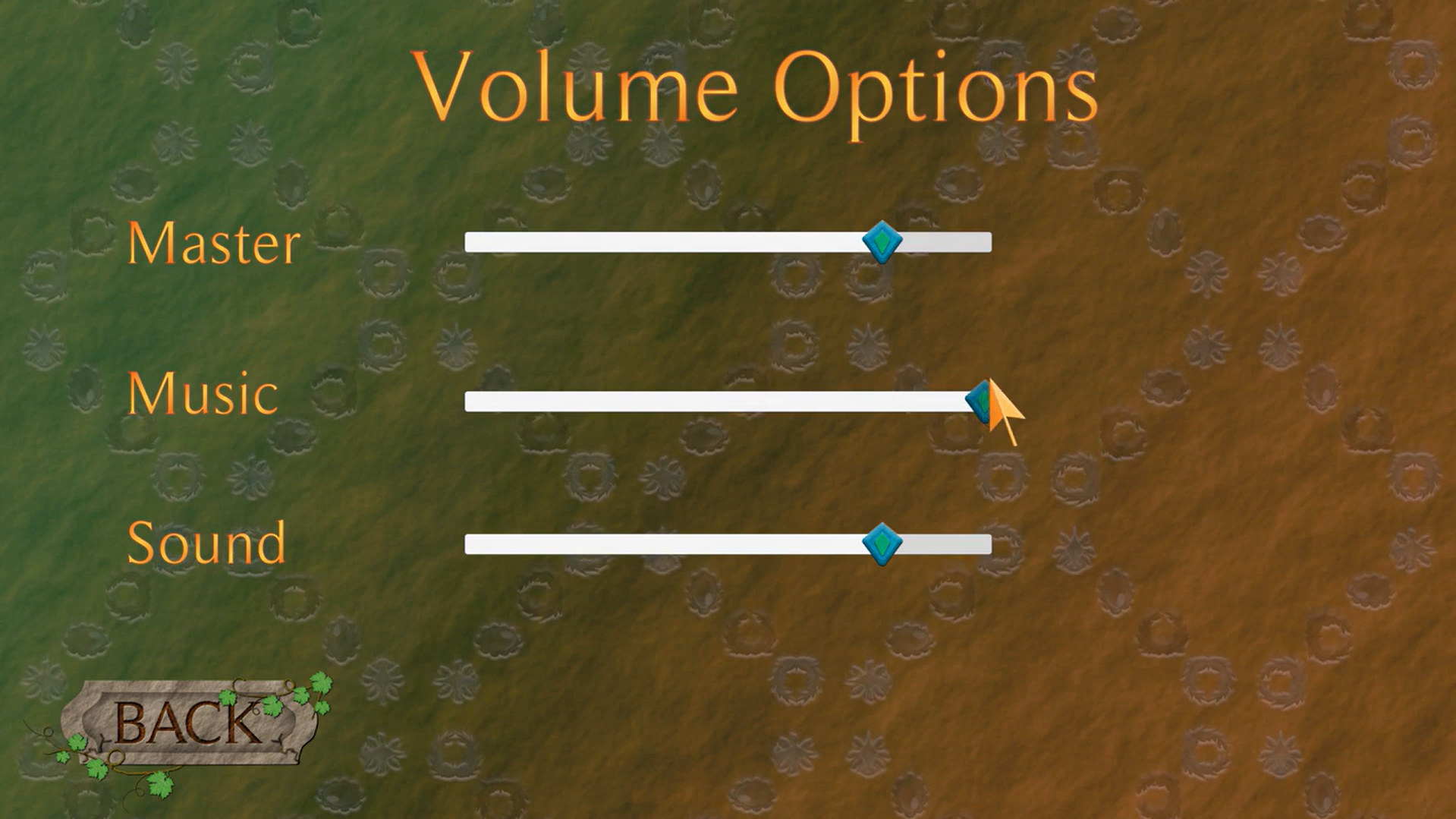
Sliders featured in the main menu